|
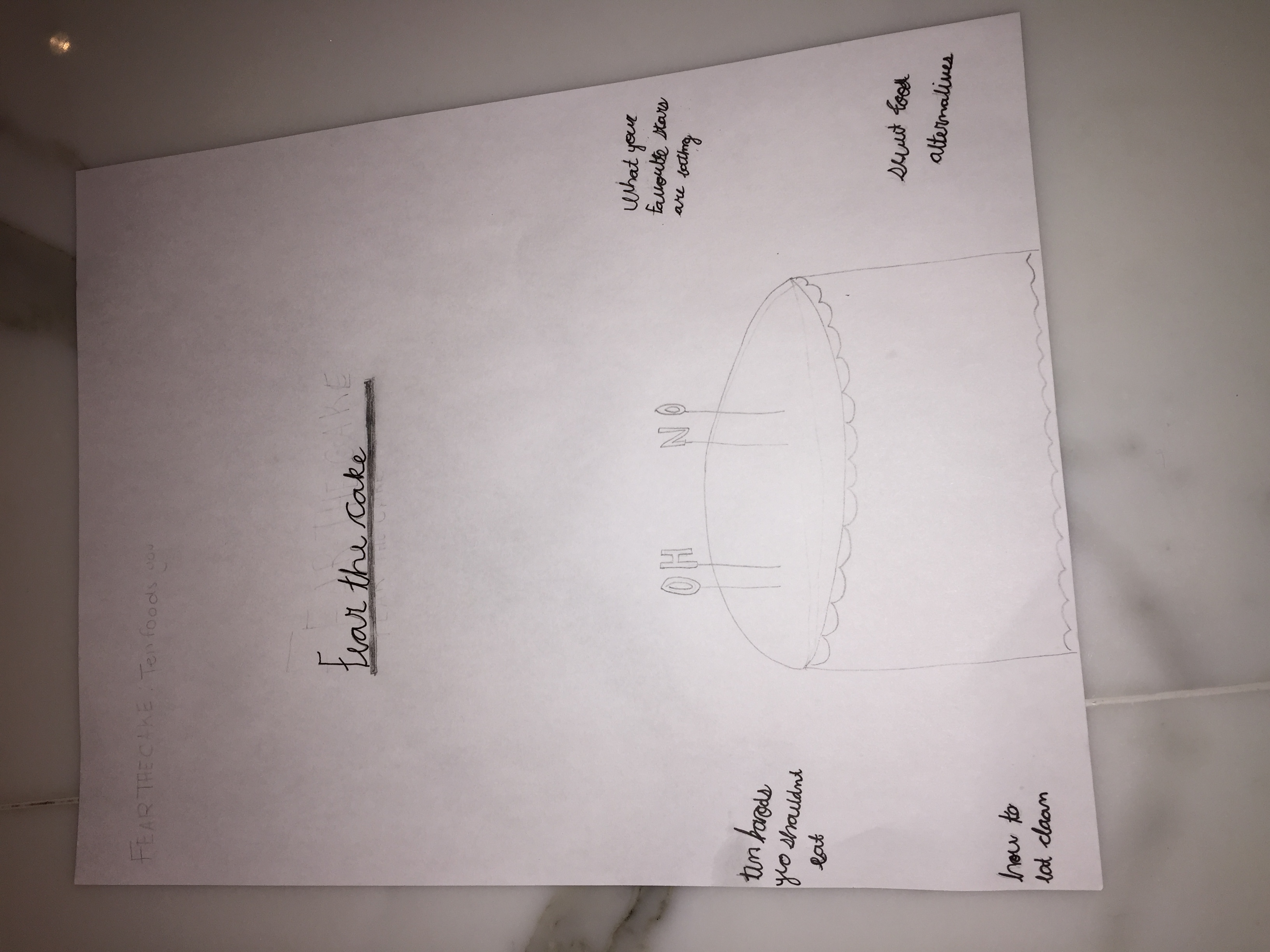
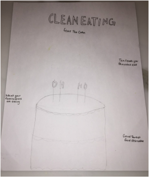
These are just ruff Sketches of what I am thinking of doing for the Lampooning assignment. I thinking of doing photography. I am going to buy a cake and the birthday letter candles and spell out something on the cake. Theses to drawings are around the basis of what I am thinking. I will most likely change things and move things around, but overall this is what I am planning on doing. 1. I will be photographing and object, a cake to be exact with letter candles. I am choosing food because its health and body image are such big thing in todays society that I wanted to make a little satire out of it. 2. I think I will either use really basic, clean font. Or I will use hand writing a little more classy. I haven't decided yet. 3. My magazine will explore the content of food and body image. Although health is very important I think that I want to bring a something funny to all the health magazines and dieting magazines because some of them are really extreme. 4. I have two ideas, one is that I will use the name of a magazine and another will be just a head line. But, I am making a satire of all the extreme health magazines. 5. I think that by making the birthday candles and spelling something out thats different from " Happy Birthday" is creative. I saw something like it on Tumblr. It was spelling out something else and I thought it would be cool to try my own version and to put it in cake. HeadLines/ Tags: - Fear The Cake - what your favourite stars are eating - Healthy sweet alternatives - Ten foods you shouldn't eat - A balenced diet is a piece of cake, in both hands ( scale)
 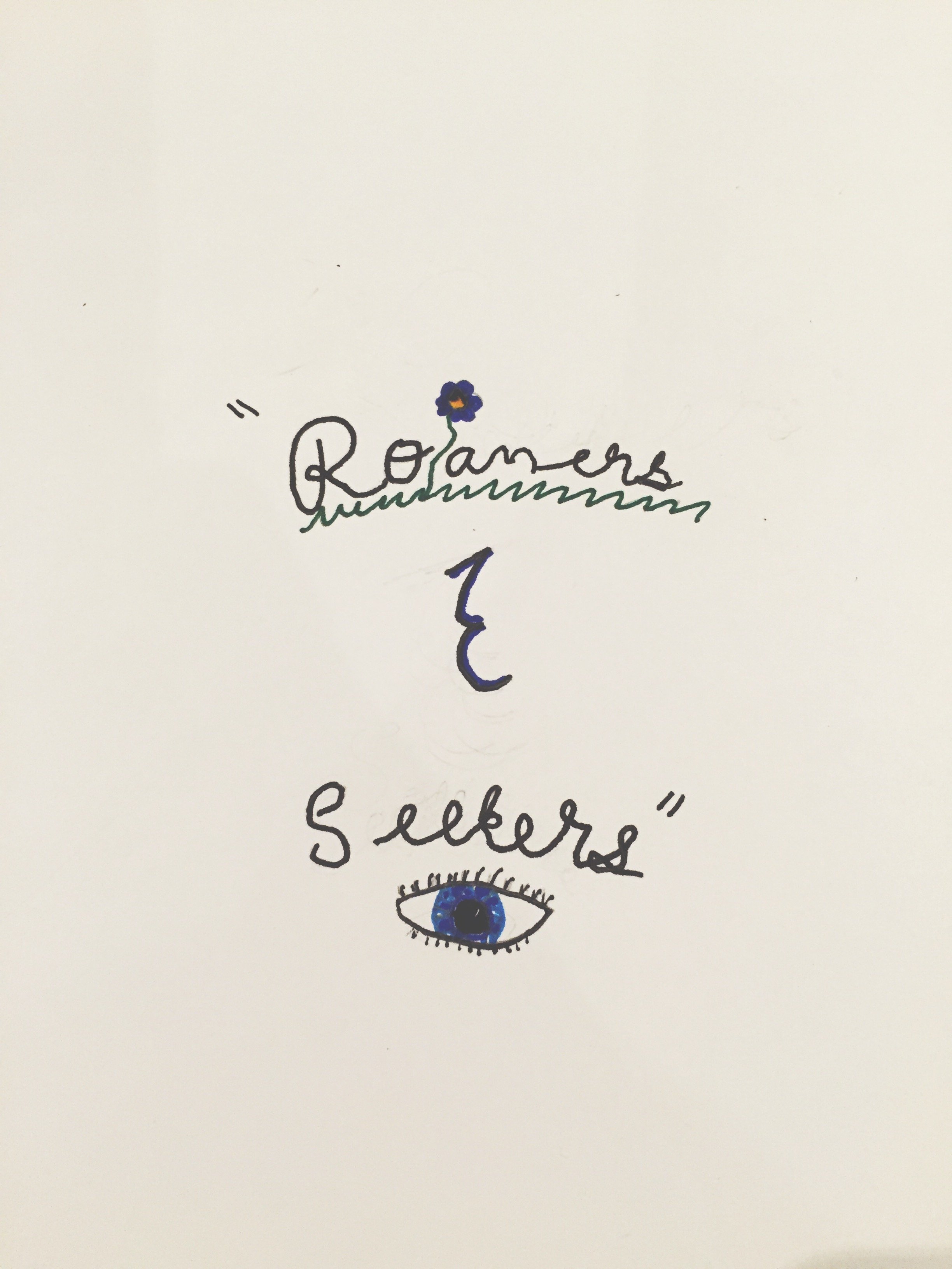 This is my Ampersand project. I decided to go with something simple since I am tended towards art that is simple and I want to draw something that I would like, since I am drawing it. The quote is " Roamers & Seekers". I decided to spice it up after writing the quote out, I added grass and a flower since the word roam reminds me of grazing. Then seekers remind me of looking as if your looking for the exit to take, which you need your eyes for. I like the way it turned out. I think its really simple and the ampersand I really like. I took it from my last one we did in class. I think its sharp looking but still cute. A challenge was getting the font the way I wanted it. Unforchanitly I couldn't find a thinner black pen and so my writing looks a little to inky, if that makes sense. Overall I enjoy the way it turned out, if I could do something different I would maybe try and make the drawings look more life like. Although my drawing skills are questionable, so for me the eye was pretty good. I have been trying to teach my self how to draw lately and the eyes has been giving me a hard time. This one is maybe close to one of the best I have drawn with pen..
This is the thing I choose to design. I liked this quote because its very true. If your not the change then who will be? Who will be there to make the peace or fix problems. Even if you are the change for little things. I liked the idea of something simple. I like things simple as you might be able to tell. Anyway I did something really simple and main stream for Be and The. Then I wanted to make something simple but pretty for the change since its the central theme and the main focal point of the quote. I like   I picked this photo because I understood it the best. There where many other covers that I pinned but I thought this photo was the best and was the most obvious to understand. Its not from a particular source or a magazine cover witch isn't great. Although, I think its funny and makes sense.
I picked this magazine cover because I liked it the best. When I first saw it I was immediately drawn to it. I love how simple it is and how the colours all look good with each other, the grey sky, pink smoke bomb and the white writing all seem to blend. I really enjoy how they split the word Youth in to you and th. It makes the piece more compelling and it to me seems to be more open, if that makes sense. It also makes if different from another magazine cover witch I think can be a good way to attract a buyers eye towards the magazine.  Here is my fall lettering assignment. I went on my favourite source Tumblr and searched up fall. I got many quotes and I found one similar to this but longer, so I cut it down into a smaller into a three word quote. I did something really simple and just played with the basic letters. Then for a little colour I decided to add a apple leaf and outline it in a red pen. I wish I did it on a regular plane white piece of paper but I didn't think that far. I tried to make up different ways of doing my letters like the word in I made it slant to the left. 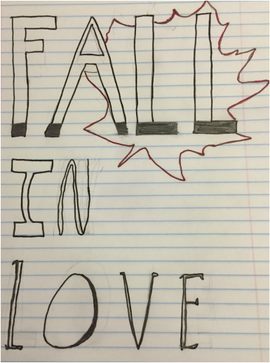 |
AuthorWrite something about yourself. No need to be fancy, just an overview. Archives
May 2016
Categories |
 RSS Feed
