|
The weekend before this assignment was assigned I watched this movie: The Departed. I liked it a lot and I thought it was very good especially since the main actor was Leonardo DiCaprio... The one scene in the movie that spoke to me the most and shocked me the most is resembled in this poster. I don't want to give anything away if you Mr. Francis if you haven't watched it ( if not I highly recommend) anyway I also thought for anyone who has watched the movie this should speak to you. I used a font that I though went with the mystery of the empty room the elevator I drew is in and all the grey tones. ( I hope its ok I took an image of google for the back ground). Anyway I also wasn't sure if my director was famous enough to put on so I didn't but I did put the date of the release date because Ironically enough its the same day as my birthday and I learned that just before exporting it so I added it really quickly and liked the way it turned out. Although I do think the elevator is a little to cartoon looking compared to everything else but what can you do when your drawing skills are super good. Over all I liked the way it turned out. 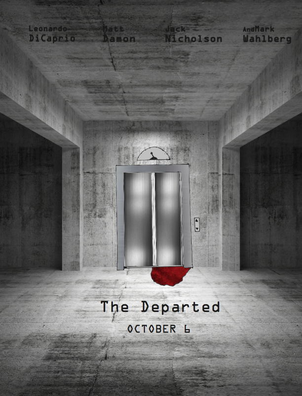
0 Comments
I decided to use this quote because skiing has been a big part of my life since I was little. Having a cabin up at whistler with a ski in ski out trail has been really awesome while growing up. Not gonna lie but during the winter at school I sometimes think about what the top of the mountain might be like at that moment. During the christmas break we drive straight up to whistler for christmas. We do a lot of skiing during the winter break in whistler because we have so much free time and love to do it. Because of this when I think of christmas I think of skiing. I am lucky to have grown up with the resources to go skiing and the big mountain in our back yard.   During this process of calligraphy I wasn't sure what I was getting into. I found that there are is a lot more to the process and art of calligraphy then I thought. There are so many different techniques that I for sure need to work on. I think that I need mainly to work on using my shoulder instead of my wrist as well as the ways the letters are formed like the thicker down stroke for example. I liked using ink and paper for a bit. I found calligraphy was a cool it as a new learning experience. It took me a few times to get what I wanted right. I think I did it 5 or 6 times till I got it right, and even now I still see things I would like to change. Although I learned doing this project that it takes lots of time to get at least a little of the process of calligraphy down.
 I picked a simple quote I found online. But it was influenced by this rusty weight I found in my garage. I hunted around the house and found white spray paint and did two coats of paint. It cracked up and I am not sure why but it wasn't what I wanted it to look like. I was planning on doing hand writing and for it to be nice and flat and clean looking. But it didn't work out like that so I grabbed some kids paint and made the letters look very messy to contrast with the unwanted cracks in the spray paint. I have always thought "down" was kind of a negative word, So I painted it blue since blue represents sadness and as well as the sea, because when I first found this quote it kind of made me thing of sinking to the bottom of the ocean, like your hitting rock bottom.
 This quote here I like because its a great motivator when you feel like there is something pushing you to not to do what you want to. It took me three times to get this done the " right " way. At first it didn't turn out the way I wanted it to and the second time Katie smudged it my mistake. So I started over for the third time and ended up smudging it.. So with time not so in my favour, Idecided to make it work. I smudged the edges of words, dropped some ink on the paper and gave it interesting affect. I think it turned out ok.
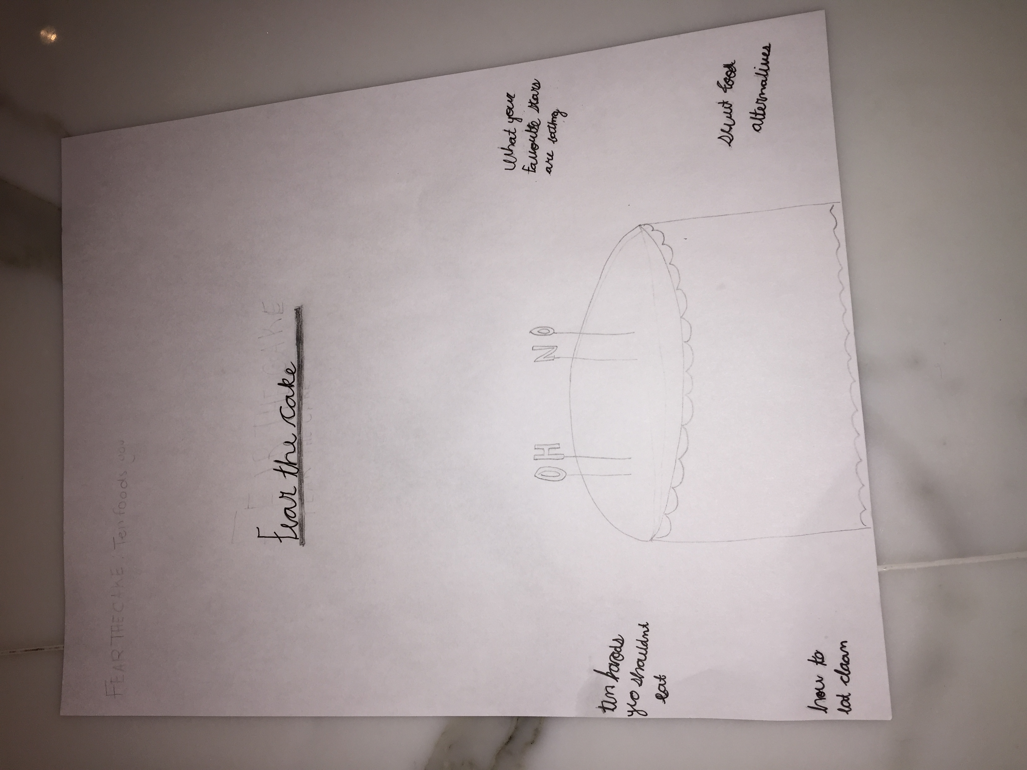
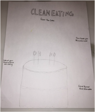
These are just ruff Sketches of what I am thinking of doing for the Lampooning assignment. I thinking of doing photography. I am going to buy a cake and the birthday letter candles and spell out something on the cake. Theses to drawings are around the basis of what I am thinking. I will most likely change things and move things around, but overall this is what I am planning on doing. 1. I will be photographing and object, a cake to be exact with letter candles. I am choosing food because its health and body image are such big thing in todays society that I wanted to make a little satire out of it. 2. I think I will either use really basic, clean font. Or I will use hand writing a little more classy. I haven't decided yet. 3. My magazine will explore the content of food and body image. Although health is very important I think that I want to bring a something funny to all the health magazines and dieting magazines because some of them are really extreme. 4. I have two ideas, one is that I will use the name of a magazine and another will be just a head line. But, I am making a satire of all the extreme health magazines. 5. I think that by making the birthday candles and spelling something out thats different from " Happy Birthday" is creative. I saw something like it on Tumblr. It was spelling out something else and I thought it would be cool to try my own version and to put it in cake. HeadLines/ Tags: - Fear The Cake - what your favourite stars are eating - Healthy sweet alternatives - Ten foods you shouldn't eat - A balenced diet is a piece of cake, in both hands ( scale)
 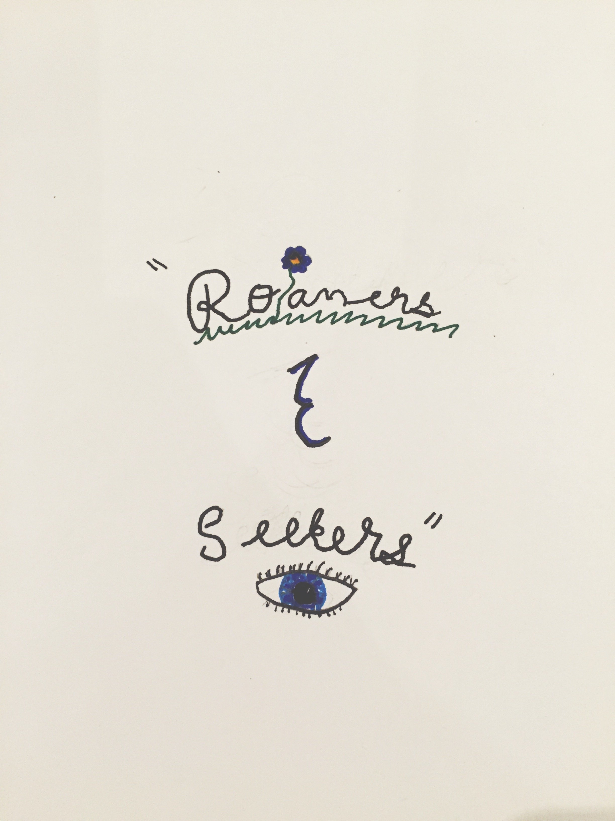 This is my Ampersand project. I decided to go with something simple since I am tended towards art that is simple and I want to draw something that I would like, since I am drawing it. The quote is " Roamers & Seekers". I decided to spice it up after writing the quote out, I added grass and a flower since the word roam reminds me of grazing. Then seekers remind me of looking as if your looking for the exit to take, which you need your eyes for. I like the way it turned out. I think its really simple and the ampersand I really like. I took it from my last one we did in class. I think its sharp looking but still cute. A challenge was getting the font the way I wanted it. Unforchanitly I couldn't find a thinner black pen and so my writing looks a little to inky, if that makes sense. Overall I enjoy the way it turned out, if I could do something different I would maybe try and make the drawings look more life like. Although my drawing skills are questionable, so for me the eye was pretty good. I have been trying to teach my self how to draw lately and the eyes has been giving me a hard time. This one is maybe close to one of the best I have drawn with pen..
|
AuthorWrite something about yourself. No need to be fancy, just an overview. Archives
May 2016
Categories |


 RSS Feed
