|
This is the thing I choose to design. I liked this quote because its very true. If your not the change then who will be? Who will be there to make the peace or fix problems. Even if you are the change for little things. I liked the idea of something simple. I like things simple as you might be able to tell. Anyway I did something really simple and main stream for Be and The. Then I wanted to make something simple but pretty for the change since its the central theme and the main focal point of the quote. I like 
0 Comments
 I picked this photo because I understood it the best. There where many other covers that I pinned but I thought this photo was the best and was the most obvious to understand. Its not from a particular source or a magazine cover witch isn't great. Although, I think its funny and makes sense.
I picked this magazine cover because I liked it the best. When I first saw it I was immediately drawn to it. I love how simple it is and how the colours all look good with each other, the grey sky, pink smoke bomb and the white writing all seem to blend. I really enjoy how they split the word Youth in to you and th. It makes the piece more compelling and it to me seems to be more open, if that makes sense. It also makes if different from another magazine cover witch I think can be a good way to attract a buyers eye towards the magazine.  Here is my fall lettering assignment. I went on my favourite source Tumblr and searched up fall. I got many quotes and I found one similar to this but longer, so I cut it down into a smaller into a three word quote. I did something really simple and just played with the basic letters. Then for a little colour I decided to add a apple leaf and outline it in a red pen. I wish I did it on a regular plane white piece of paper but I didn't think that far. I tried to make up different ways of doing my letters like the word in I made it slant to the left. 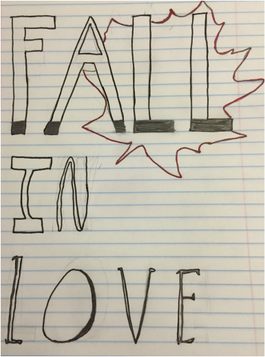 This was are first big project for Graphic desgin and I thought it was a good introducing project into the course. I now know that what you edit in the computer In illistrator it orginaly comes from your hands and sketches. This peices I am not very happy with, although it is my first piece. I kind of wish I did somthing more with my letters, because the focus point is the lips, since it was a lettering assignment. I also wish I made it more persice and more centered. For expample the word when is not centered, because the lips where not drawn in the center. Over all its an ok piece, but as any artist there are things I want to change. 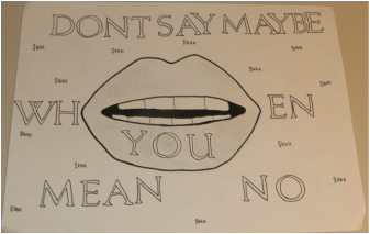
These are the drawings I thought where the most creative I did during class today. I did the gravity one first, so fragile was a play off gravity. Gravity made me think so space so I did some squiggly lines to represent no gravity hence floating around. I did the same thing but in a reflection in the fragile.
Unfortunately I am not a good drawer, as you might be able to tell. I have always found portrait drawings super cool and intricate but, I cant do them. So a challenge for me drawing these four letters was trying to make them as perfect as I could. But, I know there not and thats ok. They are the best I could do and I except that. The first two at the top where what I started with. I drew them with out any guide lines. I just drew them. The second ones I had more of a guide line. My idea was to follow the lines of the paper. It ended up changing the shape of the letters originally but its the way I saw them. I added shadows underneath to make them seem 3D but that didn't really work. These are my four letter sketches.  |
AuthorWrite something about yourself. No need to be fancy, just an overview. Archives
May 2016
Categories |


 RSS Feed
